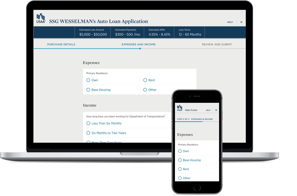
Situation
Members look to the Bank for competitive auto loans in a member facing experience.
Timebox
The car loan application was a six month project spanning two Program Increments (12 sprints).
Problem
- Members do not routinely purchase vehicles and are confused by the process
- Members do not understand financial jargon and processes
- The loan application flow was disjointed from periodic, uncoordinated updates without considering the wholistic user experience
- Content updates are difficult and time consuming due to legacy technology
- Legacy technology stack did not leverage the brand design system
- Customer service is difficult because Bank Employees see different screens than a User.
Task
- Bring the car loan application into compliance with the Design System using current technology stack.
- Create educational opportunities to increase user understanding in the process.
- Organize the car loan application for user comprehension and confidence
- Bring the car loan application into compliance with the brand Design System
Action
- Information chunking the application into similar, manageable units which people can easily process
- Provide contextual and reference educational opportunities
- Align the user interface to the brand Design System
My Role
UX | UI | IA | Management
- One of two designers creating and testing solutions
Result
- Users are confident in the car loan process
- Users understand the car loan process and the steps involved
- Increase in percent of completed self-service loan applications
- Branded and coherent user experience.
- Increase percent of completed self-service loan applications.

Solution & Artifacts
Research & Process
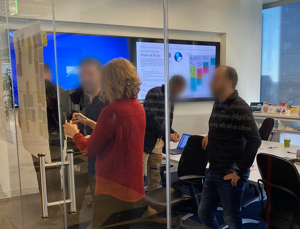 Stakeholder Workshop
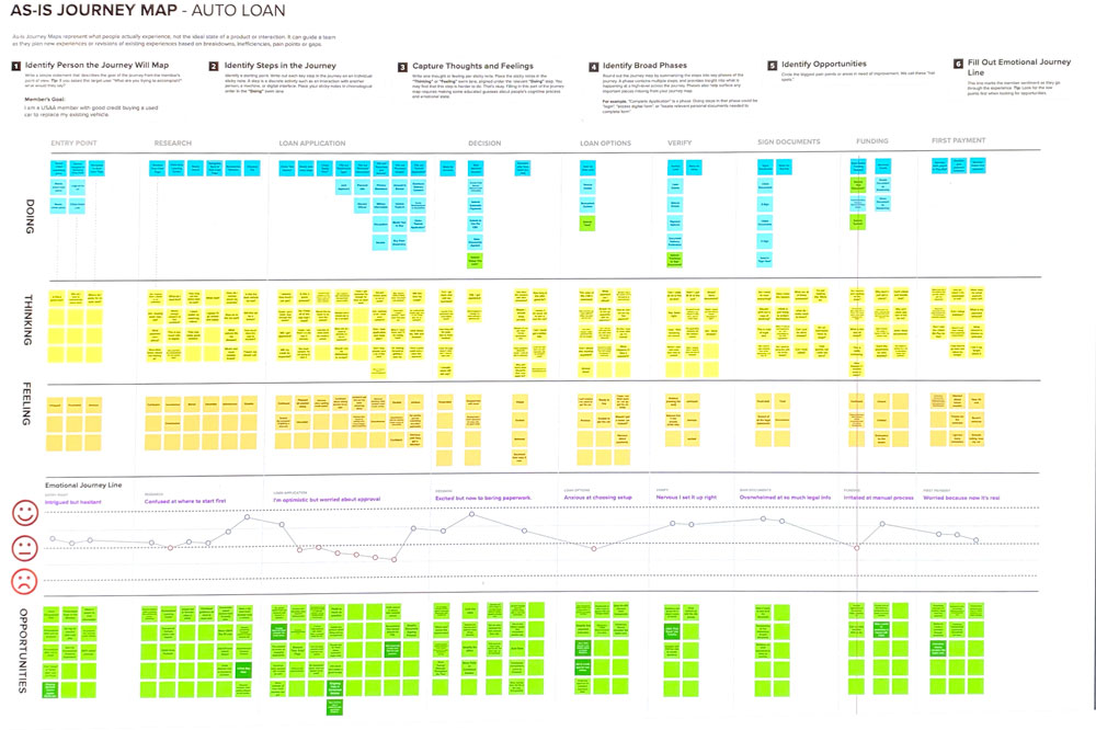 User Journey Map
 As-Is Car Loan Application
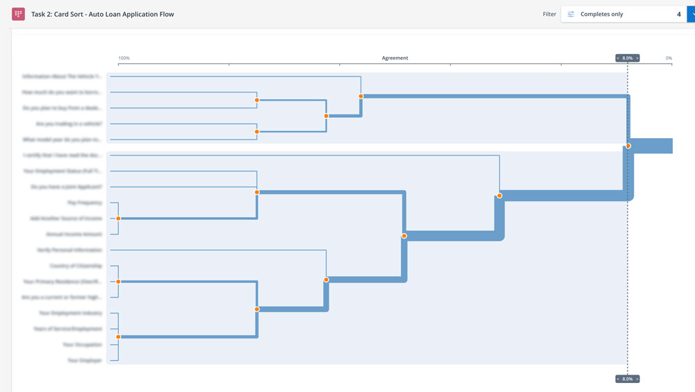 Card Sort to Chunk Application Fields
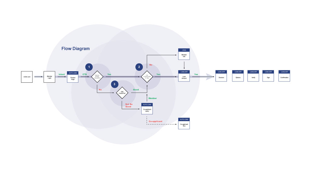 Efficiency Concept
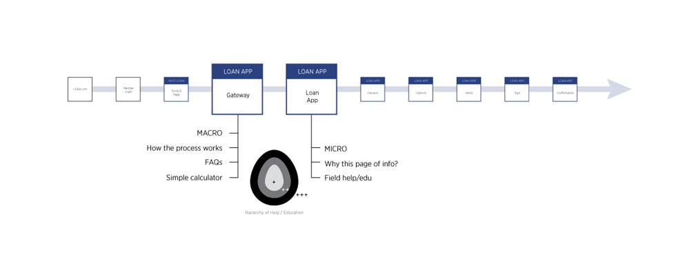 Help Concept
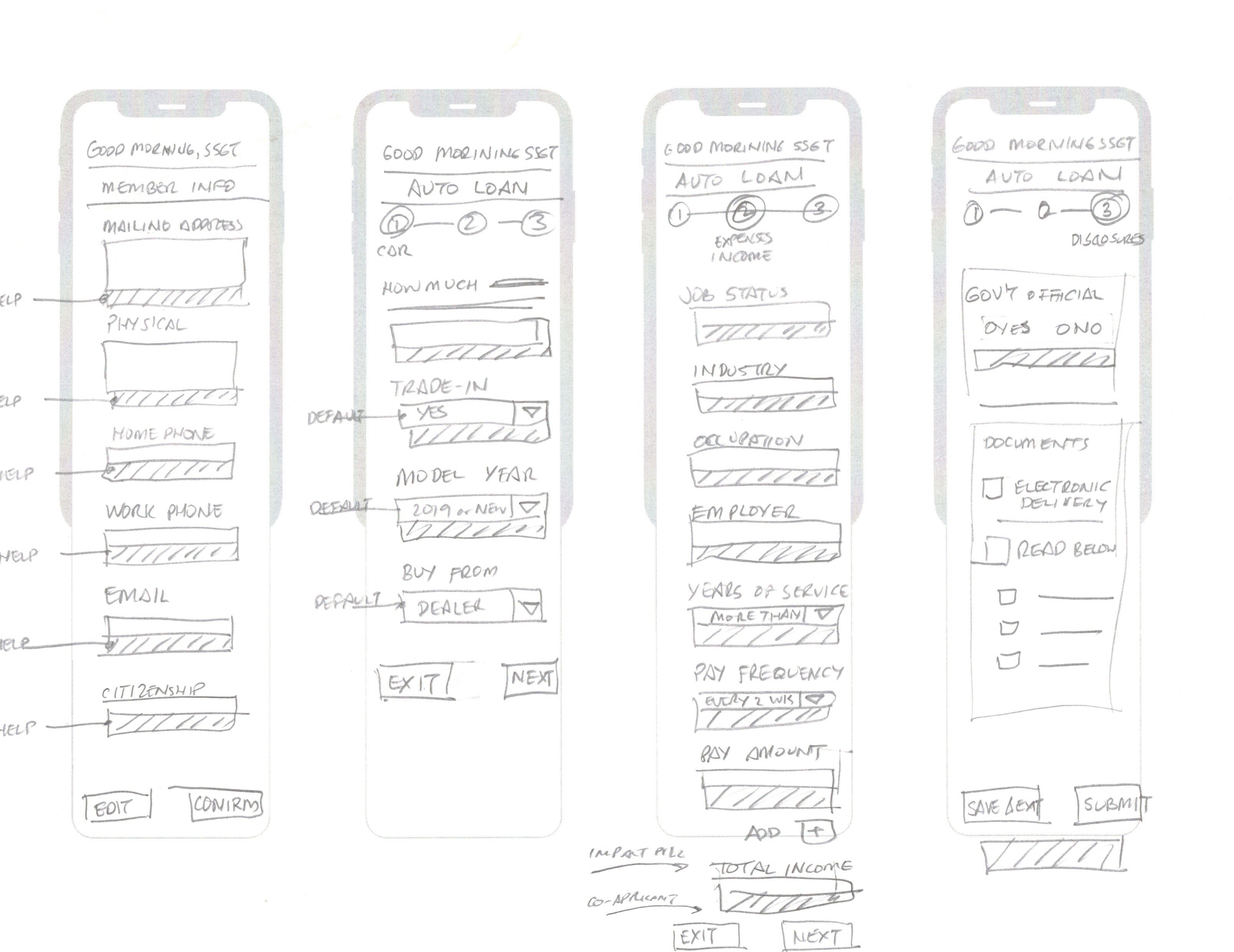 Help Concept Wireframe
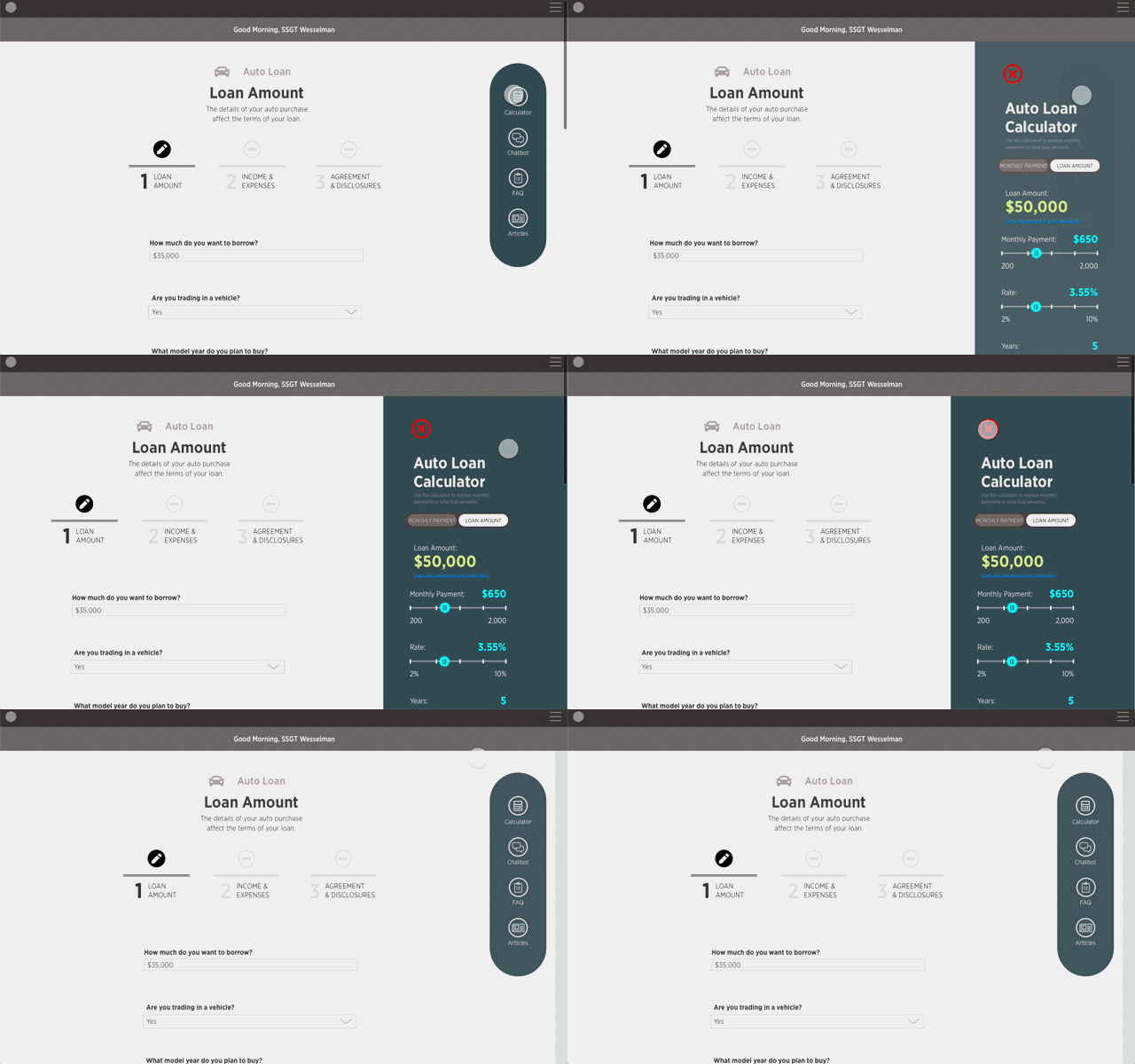 Help Concept Animation
