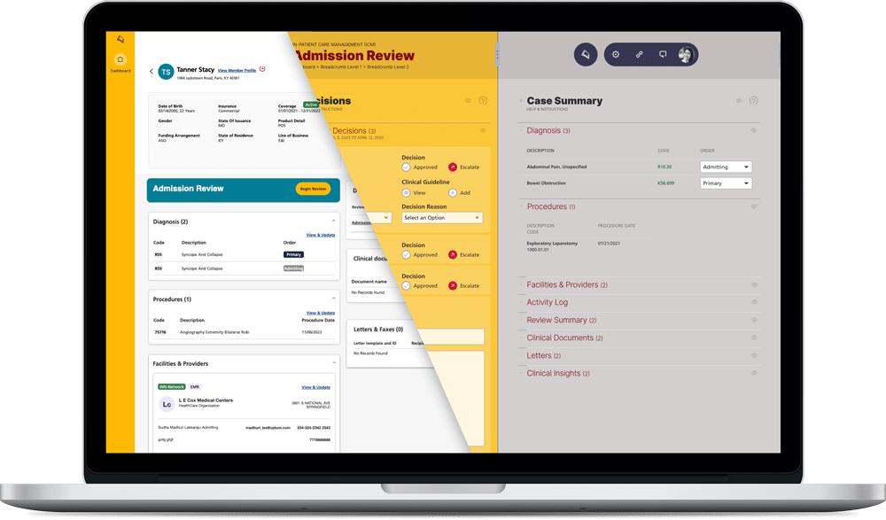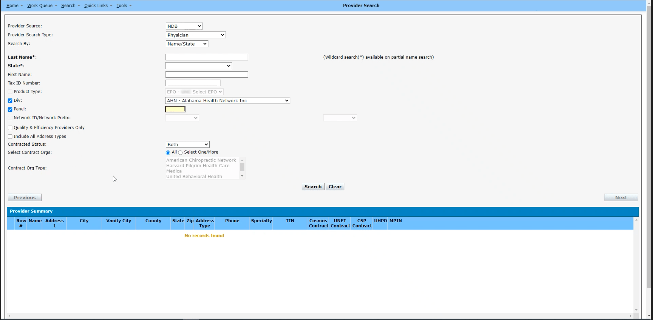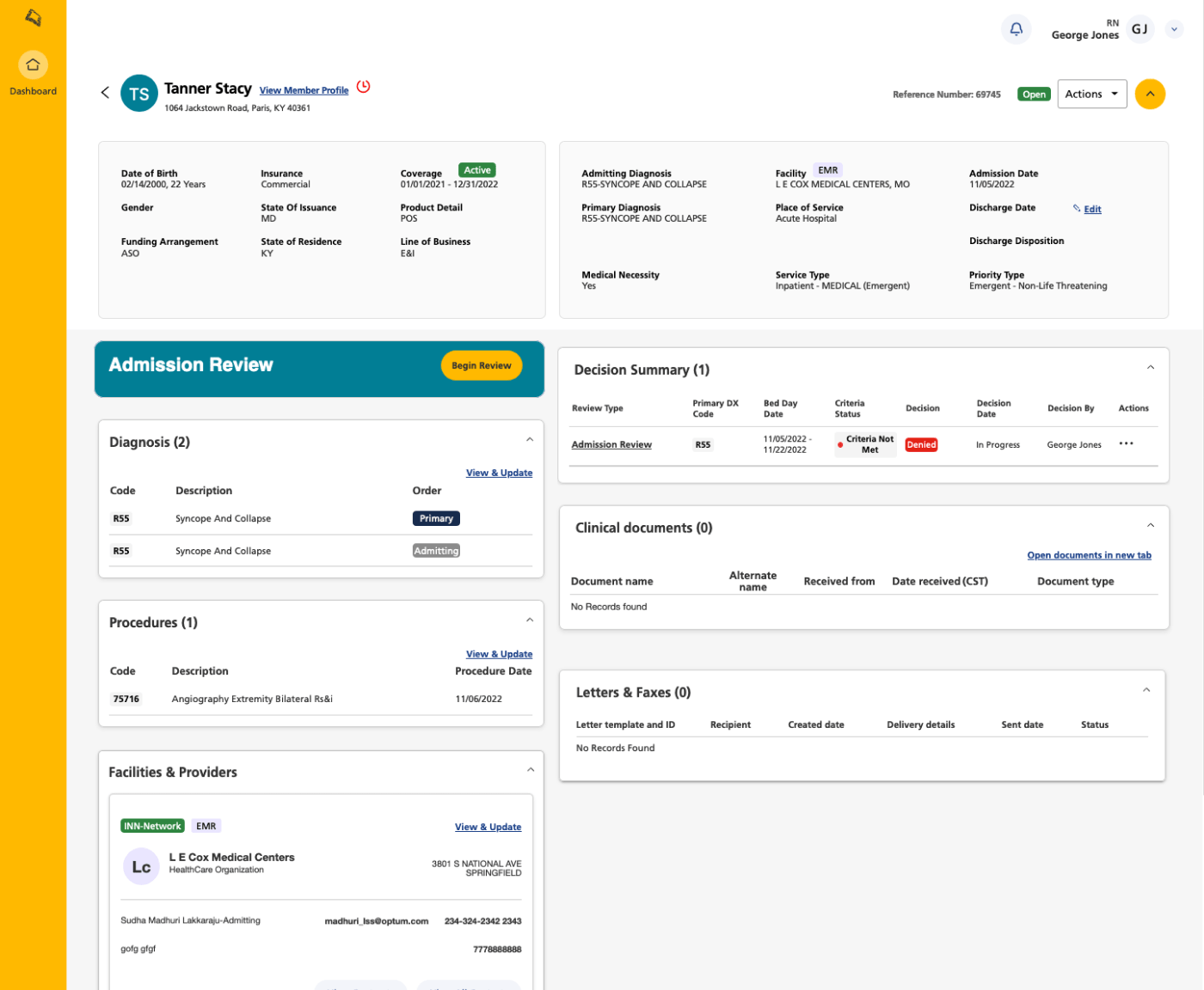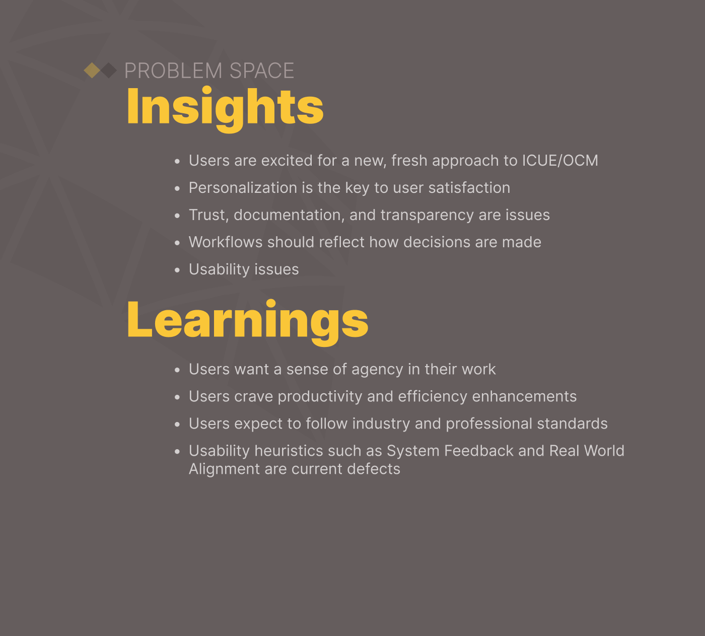
Solution & Artifacts
Prototype
Previous App

Research & Concepts


Design Solutions


Healthcare Insurance App
UX, UI, Primary Research
The desire to bring intellectual property and expertise in-house with subsequent marketplace potential is the business strategy of the Optum Clinical Manager app. While business and IT structures and processes were established, the project was launched without User Experience resources. UX immaturity created a large backlog of design and technical debt.
The timeframe for design and development was four months in dual track agile sprints.
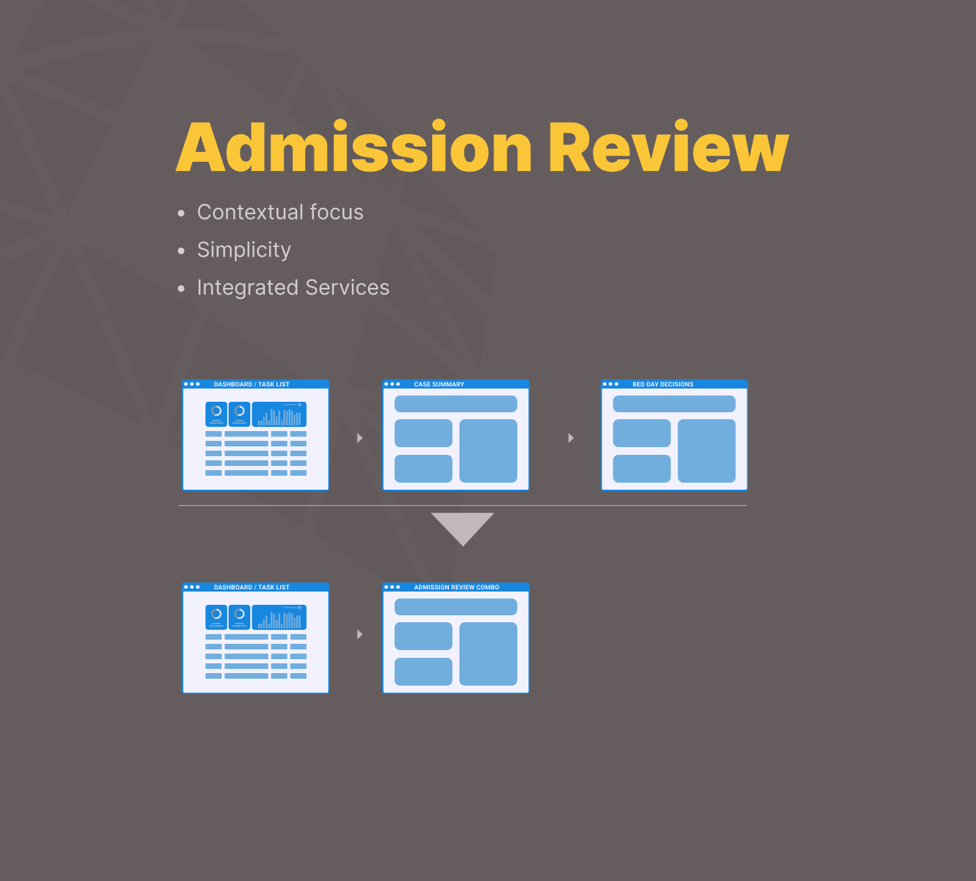
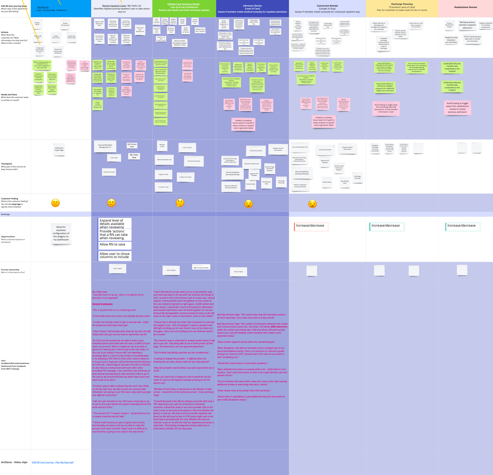
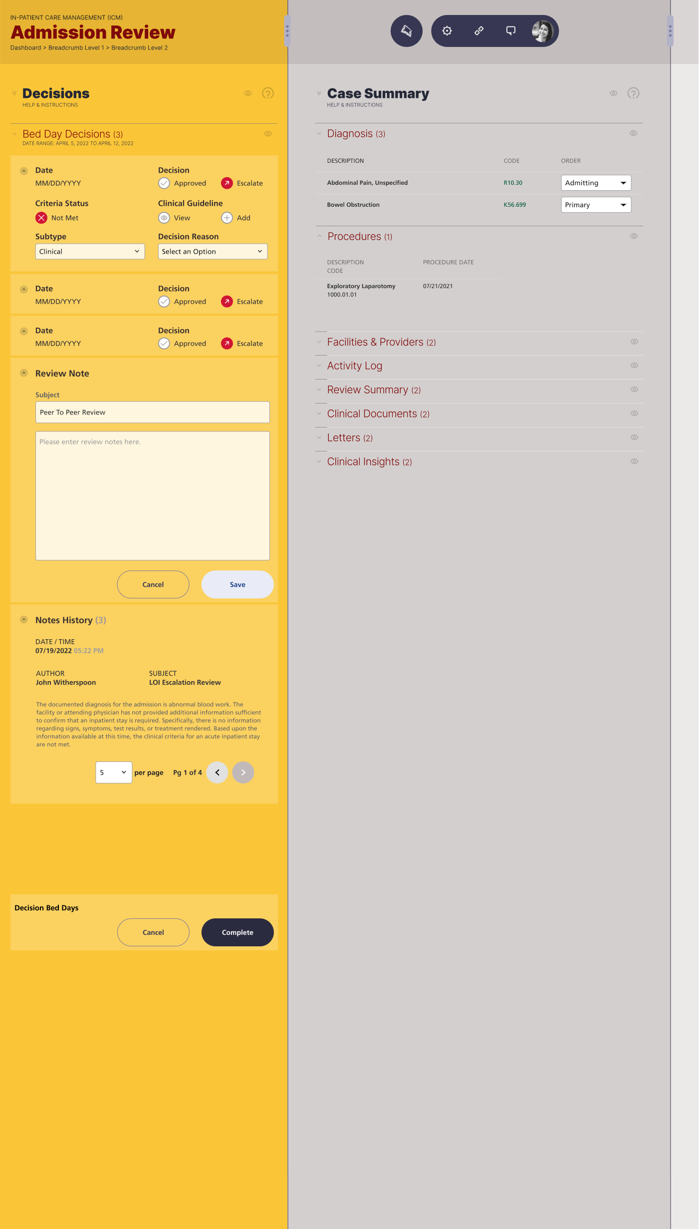
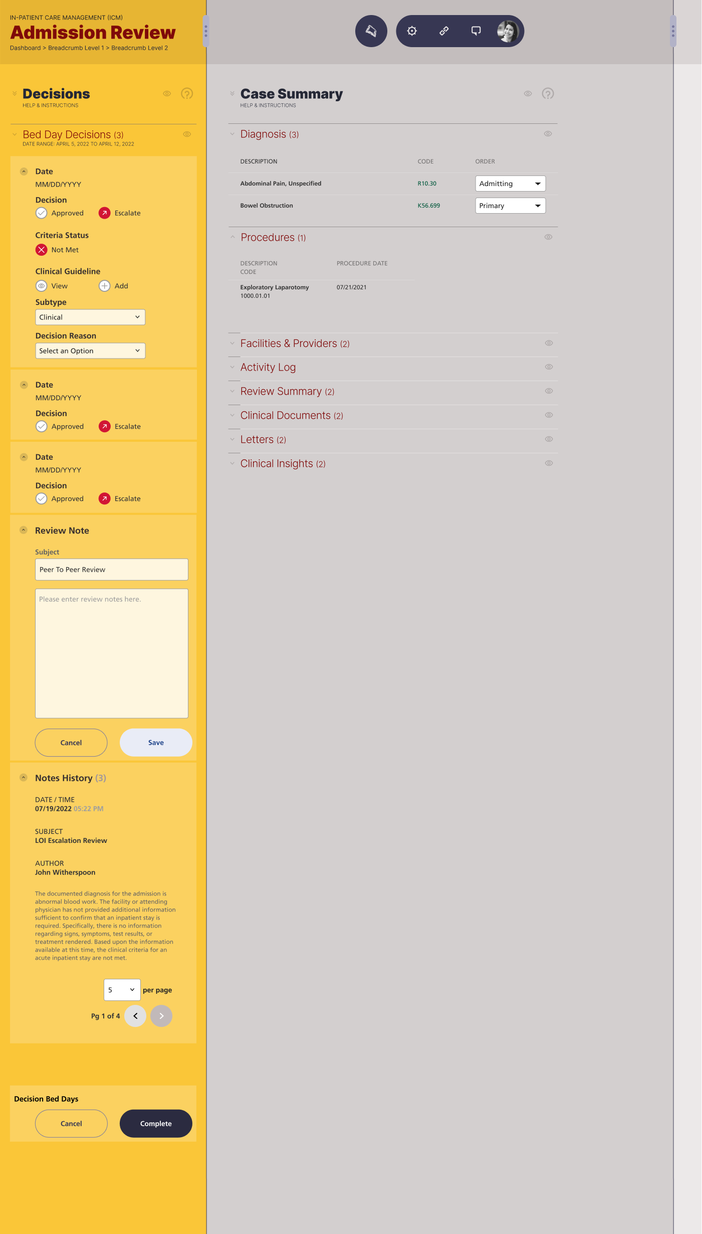
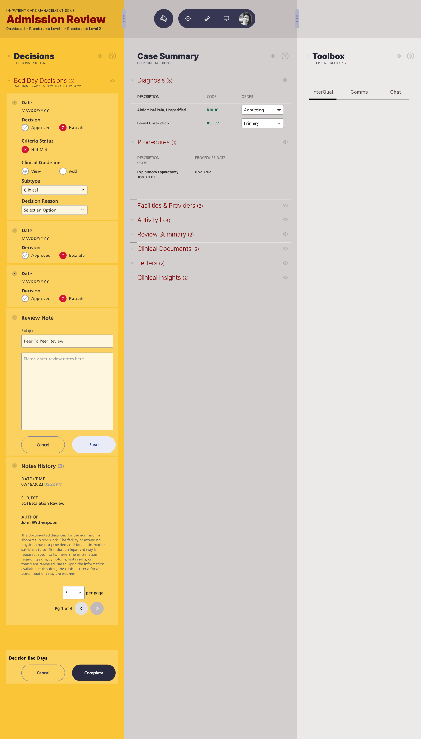
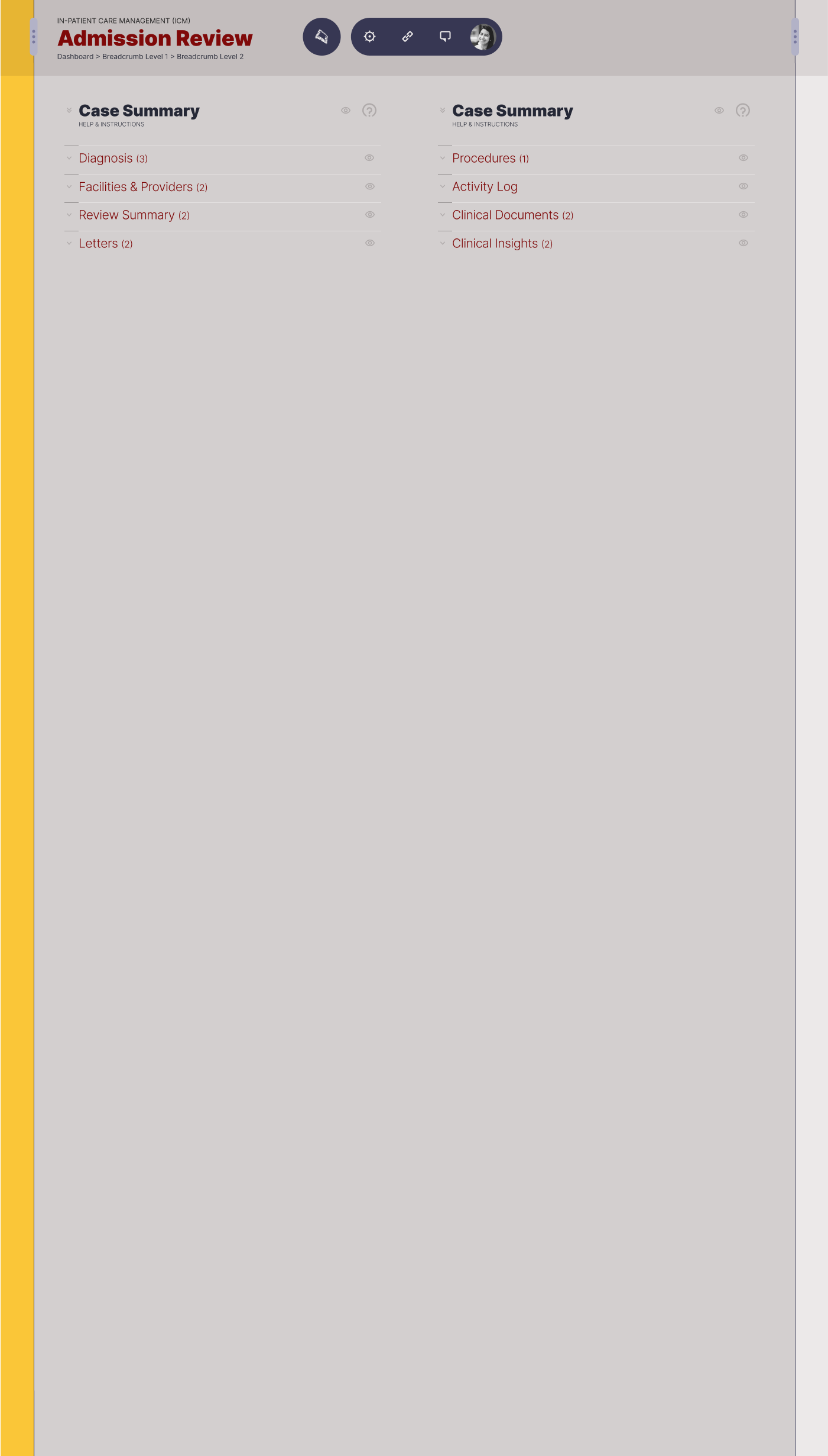
Our team was responsible for creating human-centered task flows for Admission Reviews, Concurrent Reviews, Peer-to-Peer Reviews, and Prior Authorization. I was responsible for strategic and systems thinking for end-to-end workflow.
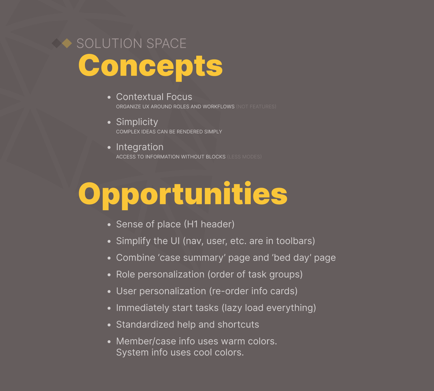
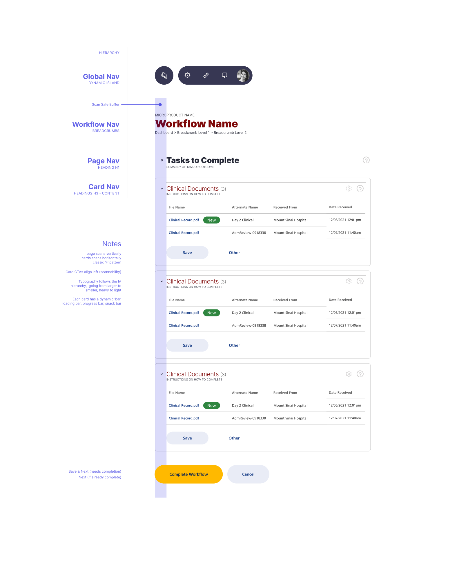
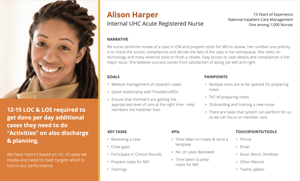
I conducted user research with our three primary user personas/archetypes. Based on the findings, I created new workflows, information architecture, and design recommendations.
UX | UI | IA | Design Mockups
Evaluative testing suggests user satisfaction and workflow efficiencies are improved an average of 60%. A multiplier effect is expected from implementing reusable design system components.
